Building Pylon-Free Web Pages: An Intro to Web Accessibility
A few years ago, when I was a student in university, I met a candidate running for student body president who had a disability that required her to be in a wheelchair. Her platform had a strong accessibility focus and she spoke animatedly about creating a university experience that supported marginalized minorities.
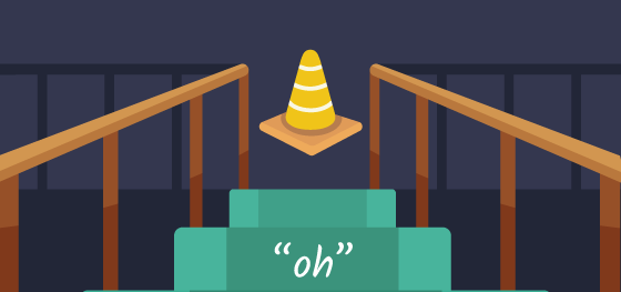
As part of her campaign, her team decorated our campus with enormous orange pylons: in front of every door, every entrance, every staircase that wasn’t accessible to her in her wheelchair. The orange flurry took me by surprise. It was one of those acutely obvious (and humbling) “oh” moments, where you learn a truth you thought you knew all along. That day has stayed with me and still frequents many of my conversations with friends and family — and now, you!
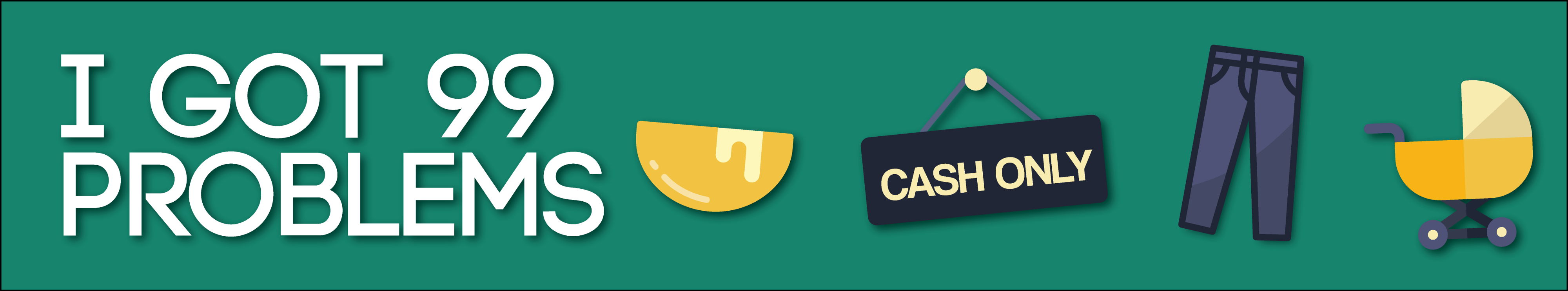
Most of us have experienced what it’s like to be unable to access something. Some of us are vegetarians at large family dinners; a cursory glance over the table tells us our best options are boiled potatoes and a pudding-like substance we can’t identify. Some of us have walked by promising restaurants, seen the “CASH ONLY” sign decorating the entrance, and groaned. Some of us have allergies. Some of us have hips (finding a pair of jeans that fit can be truly triumphant). Some of us have kids! Some of us need non-gendered washrooms, translators, therapy animals. And while each one of us has different needs and abilities, we all want to feel included and empowered in our day-to-day lives.
Today, when I’m pitching restaurant options to a group of friends, or planning community events or initiatives, there’s a very conscious voice in my head that asks: “Is this accessible to everyone? Are there any orange pylons I haven’t thought of?” Because when one person is left out, it hurts the collective whole.
Understanding Accessibility
We recently launched 10% Innovation Time at Vena — designers, QA analysts, and developers are encouraged to spend the time learning new technologies, improving tooling, contributing to open source projects, or working on proof of concepts for new features. It’s an exciting addition at Vena because it furthers the sense of autonomy and creativity many of us value in our professional lives. As someone who’s especially interested in the intersection of tech and social justice, I decided to spend my innovation time working hard to become Vena’s latest accessibility evangelist.
It is a truth universally acknowledged that every developer has, at some point(s) in their career, erroneously designed a solution — far removed from the intended goal — for a problem they never really understood to begin with. It’s an important experience, because you emerge with a newfound appreciation for the time spent understanding a problem before actually writing any code to solve it.
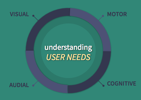
And so our ability to build accessible pages is very strongly coupled with our understanding of the “problem”. What sort of needs do our users have? What difficulties could they have navigating our page? In other words, what are the orange pylons? Let’s start by taking a look at the four chief categories of user impairments.

Visual impairments can range from complete or partial blindness to color vision deficiencies. Users with visual impairments often use a screen reader, an assistive technology that reads out the contents of a screen to the user. They might also regularly use browser zooming, screen magnifiers, and color contrast tools.
Quick Tips:
- Don’t rely solely on colour to convey information.
- Pick appropriate font sizes and colour contrasts. WebAIM provides a quick pass/fail tool to assess your colour choices.
- Don’t autoplay audio on your page; it’ll clash with a user’s screen reader. (And really, when have any of us clicked a link and been delighted by unprovoked music?)
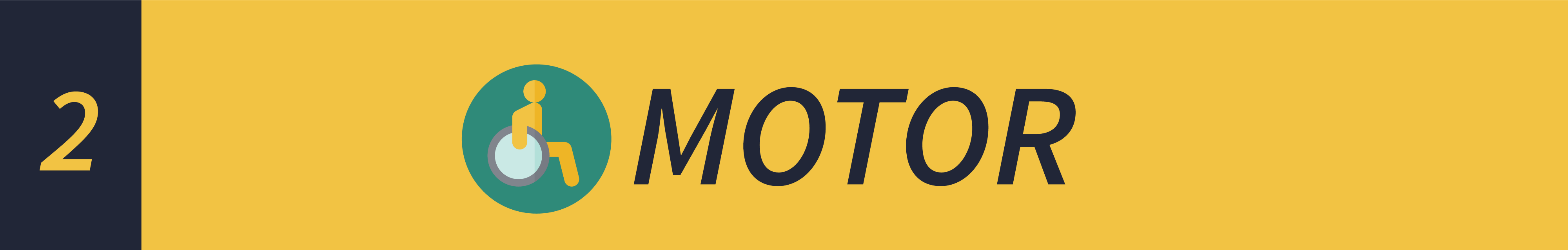
Several users have limited muscular movement. Conditions like Arthritis, Parkinson’s, and Multiple Sclerosis could lead to a loss of finger dexterity and stability, making it hard to make small and controlled movements. Users with motor impairments use a wide variety of specialized keyboards and devices, like button switches, when navigating the web. They often don’t use a traditional mouse and they might use assistive technology like voice control or even eye tracking.
Quick Tips:
- Don’t rely exclusively on movements like swiping or drag and drop.
- Are certain operations on your page only available by hovering over an element? Ensure keyboard users have an alternative way to access all functionality.
- Think about how much real estate you give to clickable elements. It should be enough space that it doesn’t require a concerted effort to access. This has the additional benefit of being helpful to users on mobile devices or smaller screens.

Hearing impairments range from partial to complete hearing loss in one or both ears. Users who are hard of hearing might have difficulty distinguishing between background and foreground noise.
Quick Tips:
- Provide transcripts and captions for all audio content. Transcripts help all users find information faster and more efficiently. And many users without hearing impairments regularly use subtitles.
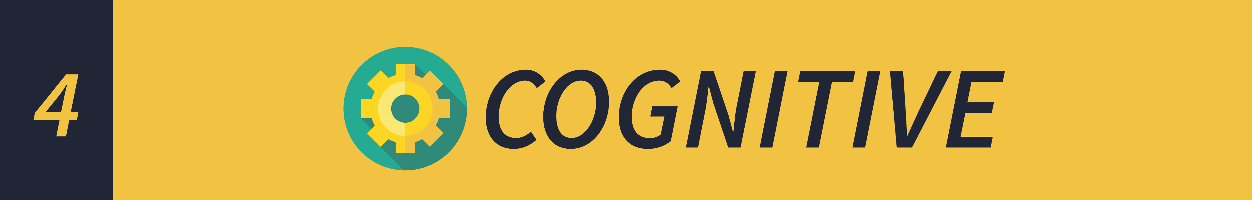
Cognitive impairments include developmental delays and neurological disorders that affect someone’s ability to process information.
Quick Tips:
- Use unprovoked movement and animation sparingly. Be skeptical of blinking, flashing, and flickering. (No one wants it. No one.)
- Make your page more usable by simplifying the interface. Don’t present too many options to a user at once. (All users will appreciate an interface that doesn’t remind them of a high-strung Where’s Waldo game)
- Think about how intuitive your application’s hierarchy is. Is it predictable? Thinking about this has the added benefit of making your page more usable to new users.
(everyone wins!)
There is a recurring theme here. Designing and developing with accessibility in mind doesn’t just improve the experience for users with impairments; it results in a more usable and accessible experience for everyone.


you get a better experience! and you! and you! aaaand you!
While a better understanding of user needs helps us think about the code we write from new perspectives, it can still be difficult to define, in a systematic manner, what an accessible page looks like — and that’s where the WCAG come in.
The Web Content Accessibility Guidelines
The WCAG are a set of guidelines created by accessibility experts from around the world with the goal of providing a “single shared standard for web content accessibility”.
The guidelines are centered around four key principles, which form the POUR acronym: Perceivable, Operable, Understandable, and Robust.
The Accessibility Tree
We’ve talked about the what and why of accessibility — now let’s talk about the how. How does your page interface with assistive technology? And how can you, as a developer, present semantic information about your application to assistive technology?
The browser uses the DOM tree and generates a modified subset of it. Information that is only used for visual purposes is stripped out, while accessibility information is created for each node in the tree. We call this modified form the accessibility tree; it acts as the hierarchical representation of your user interface and contains the necessary information to describe the interface in a way that can be understood by assistive technology. The browser exposes the accessibility tree to the operating system’s accessibility API, which can then be queried by assistive technology.
Nodes in the accessibility tree have several key pieces of information:
- a name that identifies it — this can be a visual label or a text alternative
- a role that describes its purpose — for example, it could be a “button” or a “menu”
- a state that exposes its current condition — such as “selected” or “checked”
- a value for elements that have one — like an
inputor aselectfield
Consider the following HTML:
<fieldset>
  <legend>Do you prefer tabs or spaces?</legend>
  <label>
    <input type="radio" id="tabs" name="indentation-preference"/>
    Tabs
  </label>
  <label>
    <input type="radio" id="spaces" name="indentation-preference"/>
    Spaces
  </label>
</fieldset>
Inspecting the <input> element for the Spaces option using Chrome Dev Tools, we can see its representation in the accessibility tree under the Accessibility tab. Its role is radio, its name is Spaces, and its state is checked.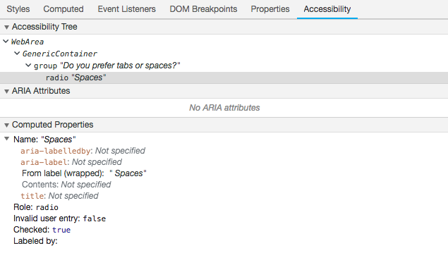
The real measure of how accessible a page is begins here: by examining how well defined its accessibility tree is and how informative it is to assistive technology. Let’s take a look at a few guiding principles.
Best Practices
1. Don’t reinvent the wheel
So you’re working on a feature and it needs a button. A cool button. You go ahead and type:
<div class="cool-button" onClick=doSomethingCool()>
  Something Cool
</div>
It’s cool. It’s clickable. But is this (imposter) button focusable? Can I tab to it? Can I use it without a mouse? Can I tell when it’s focused? Can the browser tell, programmatically, that its role is a button? As a screen reader user, will I hear it announced as a button? Will I know that I can interact with it?
Using a native element, like a <button> in this case, not only means that you don’t have to handle implementing keyboard events and focus yourself, but that your element has implicit semantic meaning. Its role will be included in the accessibility tree without you having to do additional work.
We often make the mistake of thinking it’s more work to style native elements when really, it’s more work to make custom elements that are usable and accessible.
2. But if you must…
Not every component you want to build will have a native HTML equivalent. So in the cases where you need to make a custom element, you’ll need to implement focus, add keyboard behaviour, and convey semantic meaning.
You can use the tabIndex attribute to specify the tabbing order of an element. A negative tabIndex removes the element from the tabbing order (even if it’s implicitly focusable), while a tabIndex of 0 inserts it in the order. Using a positive tabIndex is generally considered bad practice.
<div tabIndex="0">I’m focusable!</div>

<button tabIndex="-1">I’m not!</button>
As for conveying semantic meaning, the ARIA spec allows you to define things like roles, states, and properties to assistive technology. For example, consider the <ul> below. Using the aria attribute role allows us to convey to assistive technology that this isn’t just a list; it’s a menu and a screen reader would announce this as a menu with two options.
<ul role="menu" aria-label="About">
  <li role="none">
    <a role="menuitem" href="#mission">Mission</a>
  </li>
  <li role="none">
    <a role="menuitem" href="#team">Team</a>
  </li>
</ul>
3. Pursue an intuitive DOM order
We often use CSS to position elements in our layout. While this isn’t necessarily bad on its own, when you couple it with a DOM order that isn’t intuitive, it can present an important accessibility pitfall. Consider the example below.
<button style=“float: right”>Submit</button>

<label for="city">City:</label>
<input id="city" type=“text”>

<label for="zipcode">Zip Code:</label>
<input id="zipcode" type="text">
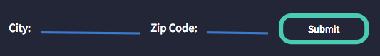
We’ve used float: right to push the Submit button to the right. However, in our DOM, it appears first. And since native elements are inserted into the tabbing order based on their position in the DOM, this means keyboard users would see the submit button focused first before the two input fields. Screen reader users would also hear the submit button announced first.
Here, the fix is straightforward: we’ll move the submit button to the end.
<label for="city">City:</label>
<input id="city" type="text">

<label for="zipcode">Zip Code:</label>
<input id="zipcode" type="text">

<button style="float: right">Submit</button>
An intuitive and meaningful order is so important for accessibility; it’s mentioned twice in the WCAG:
1.3.2 Meaningful Sequence When the sequence in which content is presented affects its meaning, a correct reading sequence can be programmatically determined.
2.4.3 Focus Order If a Web page can be navigated sequentially and the navigation sequences affect meaning or operation, focusable components receive focus in an order that preserves meaning and operability.
4. Use programmatic labels
Let’s take a look at this popover.
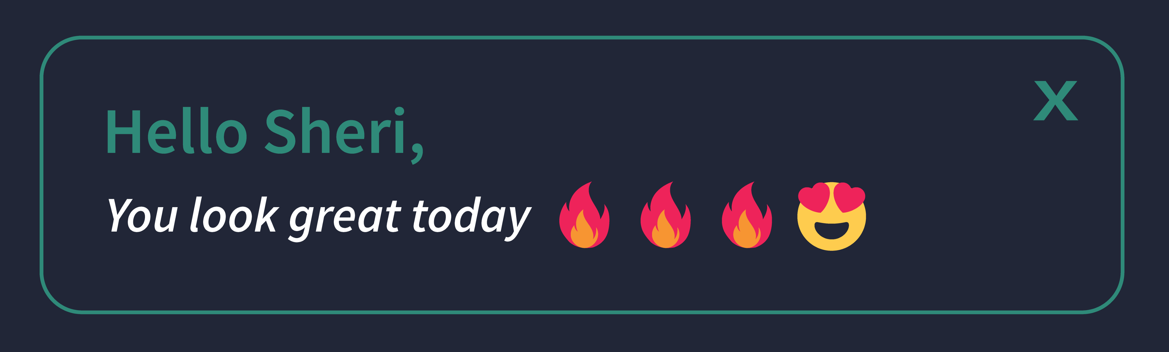
As a visual user, I know the X in the top right corner of the box will close it. Its position and my learned experience of the web communicate that to me.
What if I was a non-visual user? What communicates that same piece of information to me? Well, this brings us back to the name property of each node in the accessibility tree. Using the aria-label property, I can programmatically define a non-visual label for this node.
<button aria-label="Close" onclick="close()">X</button>
This becomes especially important for images. The alt tag can be used to provide text alternatives for images. Without it, a screen reader would announce the following image as "/IMG_5458.jpg", which is hardly helpful.

<img src="/IMG_5458.jpg" alt=“a positive possum that believes in you”>
Conversely, an empty alt tag or the aria-hidden property can be used to hide content from screen reader users. In this password field, the label “Password” does enough to communicate the purpose of the input. A screen reader user doesn’t need to know about the icon.
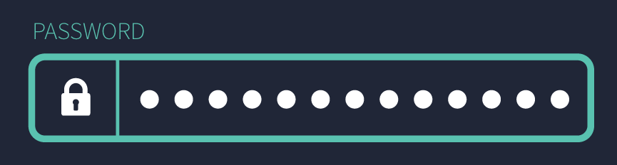
<img src="/keypad-lock.png" alt="">
For form controls, associating a <label> with a control can be done with a for attribute matching the id of the control or by wrapping it in a <label> element.
<label for="subscribe">Subscribe to Newsletter</label>
<input type="checkbox" id="subscribe">

<label>
  <input type="checkbox">
  Subscribe to Newsletter
</label>
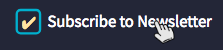
In this example, this has the additional benefit of allowing a user to toggle the checkbox by clicking the label, which is useful for mobile users or users with motor impairments.
5. Use HTML5 structural elements
HTML5 offers several structural elements for better document structure (header, footer, nav, main, article, section, aside, etc..). Not only does using them make your code cleaner and more readable (say a solemn goodbye to repetitive <div> spaghetti hell), but it also helps assistive technology like screen readers to communicate the page’s contents to your users.
A screen reader announcing “this is a header” because it interpreted a header role is the equivalent of a visual user seeing large text and interpreting that to mean a header. The more semantic and expressive your HTML is, the more value assistive technology can extract from it. For example, most screen readers provide users with page summaries. As a user, I can hear all the headers on a page and navigate to a specific one. Or navigate directly to the footer. Or look through all the links on the page.
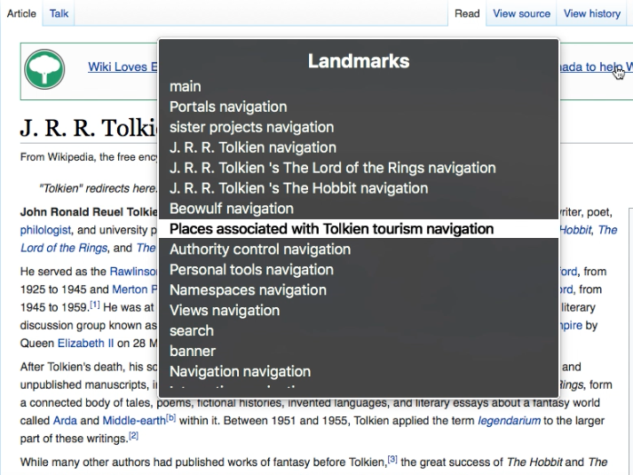
Navigating the landmarks on a page using VoiceOver, Mac’s built-in screen reader
So you think you can code
I hope the biggest takeaway here is that our definition of good code and good design needs to include accessibility, that it’s better for everyone when it does! Get intimately familiar with the WCAG! Do a pushup for every accessibility fail you miss! Challenge your team to incorporate accessibility into its testing process!
And most importantly, remember to ask (in the realm of code and outside of it), “Is this accessible to everyone? Are there any orange pylons I haven’t thought of?”
The world (and the web) will be better for it.
—
This post first took the form of a talk I gave at ExploreTech, a kickass Toronto meetup supporting diversity in tech.